The Null Device
2016/4/27
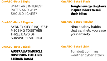
The Australian Broadcasting Corporation, Australia's national broadcaster, is in the process of developing a unified visual identity for its properties; and in doing so, has commissioned a new typeface for use across its online properties; it's named OneABC, is a modern sans-serif , and this is what it looks like with a selection of headlines reflecting the Australian zeitgeist circa 2016:
The ABC stresses OneABC's true-blue dinky-di Aussie pedigree and characteristics; it was developed locally, by an outfit named the Australian Type Foundry, and is said to be characteristically Australian in its design:
First was the connection to the land with a coastal and outback feel. The open spaces of a wide brown land played a significant role. A sense of contrast that is simultaneously austere and rich. A true sense of inclusiveness that celebrates diversity and multiculturalism. And finally that special larrikin mentality that does not take itself too seriously.
Which are some fine words, though I'm not sure how they relate to the actual typeface, which looks as if it could have just as easily emerged from Berlin or Amsterdam; I can see a bit of FF DIN and Erik Spiekermann's Meta in its heritage; meanwhile, the distended 'k' resembles earlier versions of Google's Roboto. Perhaps, at a stretch, the rounded tail of the ‘y’ could count as “Australian”, feeling a bit more casual than the sharp angles of more geometric typefaces. As for “special larrikin mentality”, I'm not sure I see it, but that may not be a bad thing: the idea brings to mind some kind of Ken Done-themed Comic Sans, with serifs modelled on Dame Edna's glasses or something.
Could one make OneABC look more distinctly “Australian”, rather than generically modern? Perhaps increasing the x-height to be equal to the height of capitals would embody the spirit of “mateship” and the “fair go” (and prompt the typical accusations from the Liberal Party and the Murdoch press of being subliminal Marxist propaganda, thus keeping with the ABC's reputation). Other than that, short of having boomerang-shaped descenders or other tourist-shop kitsch, I can't think of how one would design an “Australian” typeface.