Unfortunately, at £100 per weight (and £1,000 for the whole set!), it is a bit on the pricy side; if that's out of your price range, you may wish to consider just using Helvetica and hoping that nobody notices. (And, to be honest, few people would be able to tell the difference.)
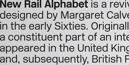
(Note that if you decide to be even more thrifty and use Arial, people will laugh at you.)
And here is a detailed article on the evolution of the London Underground typeface, from Edward Johnston's 1920s original (which influenced the design of Gill Sans), to its subtle redesign by Japanese typographer Elichi Kono in the 1970s (Kono's account appears here), and other adaptations made recently as it was adopted across the entire London transport system.
I think the typeface industry has probably the most similarity to the fashion industry. Both produce goods which are both aesthetic and practical, and where a premium is paid for (a) looking good and (b) standing out. You have the low end of the market (i.e., Primark/Wal-Mart clothing or Arial/Verdana/Times New Roman), which is good enough for people who don't care about these things much; above that you have a few classic typefaces you generally need to pay for (i.e., Gill Sans, Palatino, &c.) and above that, designer fonts whose designers can charge a premium, at least before they get overexposed. And, at the bottom end, you have badly-made free knockoffs, which are sort of like charity-shop handouts or something.
IMHO, typefaces are like clothing for words.
Ah, but Rail Alphabet is a design classic, much better than Helvetica for signage due to its optical clarity.
And I've got the original 1965 version in two weights - for free!
Truth is that a model railway website had made it available. I presume that someone had produced a digital version for the sign industry, when that went over to stylus cut vinyl.
If you want to pay big bucks for New RA, then that's up to yourself.
And yes, I would laugh at anyone using Arial!
Janet: that's interesting. How good is the quality of the typeface?
acb:
Top notch!
I actually use it for signage! I've even got the pictograms!
Works brilliantly with Inkscape as the originating software. I then save as PDF for output on a large format machine.
Interesting; where did you get it from? Is it still obtainable?
I still can't get my head around the idea anyone would pay hundreds of dollars/pounds to use a font, especially one so similar to another.
Can you see any parallel between the font industry vs. other famous "intellectual property" industries such as music, movies, TV, newspaper articles, or even patents?